Back in the day, when customer support teams had to rely on physical binders and folders to store information, it was pretty common for companies to create their own knowledge base systems. But as technology evolved, so did the way customer support departments gathered and shared information.
We'll explore some of the key features that make these knowledge bases great. So, if you're looking for some inspiration, read on!
But first:
What makes a good knowledge base?
Think of a good knowledge base as an encyclopedia explaining your product or service.
Add to it a smart, full-of-recommendations search engine. Pack it all into an intuitive and sleek user interface that matches your branding and sensibly guides a visitor through your knowledge resources.
Don't forget about personalization, if possible.
There's at least a few areas that can make or break a knowledge base software, including:
- Knowledge management
- Search
- User interface
- Appearance
Let’s look at these in more detail.
Your content should be well organized, so visitors can quickly find their way around. Knowledge base articles should be consistent in terms of knowledge and the tone of voice of your brand. They should be packed with images, videos, and GIFs to provide better explanations.
Search
Good knowledge base tools place search bars in a prominent position, so visitors can quickly reach it and find answers. The best search bars display content recommendations that contain keywords either in the title or the body paragraph of a knowledge base article. And it should be fast.
User interface
The user interface of a knowledge base can be just as important as the content itself. After all, if users can't find the information they're looking for, or if they find the interface confusing, they won't be happy. It's crucial to provide quick access to categories, FAQs, news, or other help formats, such as webinars and videos.
Appearance
The visual side of a knowledge base should match the branding of your business, so visitors see and know where they are. The best tools allow users to choose knowledge base templates, colors, images, URLs, and more.
That's pretty much it.
Create a knowledge base that puts the reader first. It will make customer self service a breeze and improve customer experience. In the long run, it's healthy for the business as it translates to lower costs and a smaller workload for a customer support team.
Knowledge base examples
Atlassian: powerful sidebar
Atlassian has a range of digital products for IT. It has a huge knowledge base that stores information about every product, so you start by choosing the product you use.
Let’s pick Confluence, which is a knowledge management system for internal use.
One of the strengths of this knowledge base are categories. Confluence has a lot of information in its knowledge base, but it does an excellent job of breaking things down and making them easily accessible to visitors using categories.
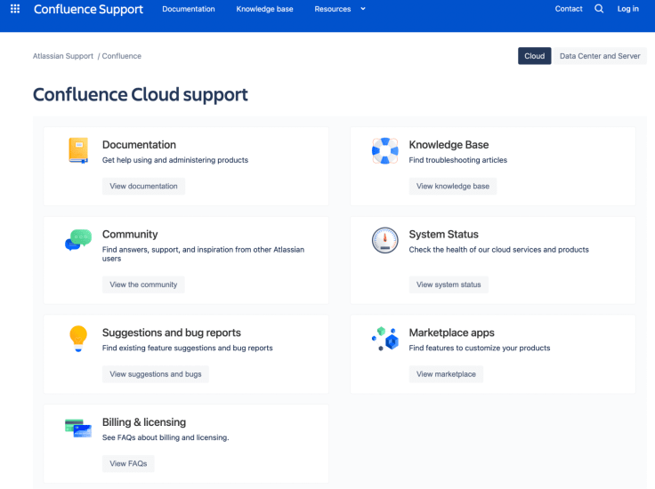
Each category lists articles about relevant topics a user can access right away.
Another great thing is that there are plenty of reading recommendations inside an article, so you can delve deeper without much digging.
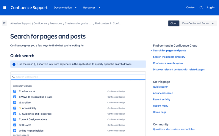
In this way, Confluence guides you through your education process, so you can quickly become proficient.
Things to pay attention to: powerful sidebar.
Canva: minding target customers
Another knowledge base example comes from Canva, an online design tool.
The first cool thing about it is that Canva's knowledge base provides a fast track to the most popular search queries right under the search box.
Since Canva's user base is made up of novice designers, the search functionality autofills recommendations and offers results that are relevant to what people may be searching for, just in case they don't know design terms.
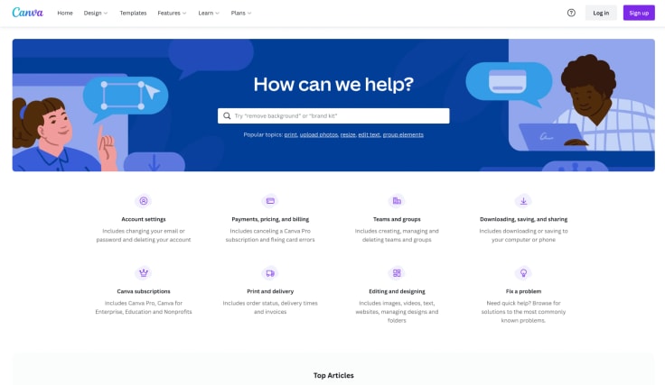
Canva's knowledge base is a good example of how to build a knowledge base for specific people, depending on their goals.
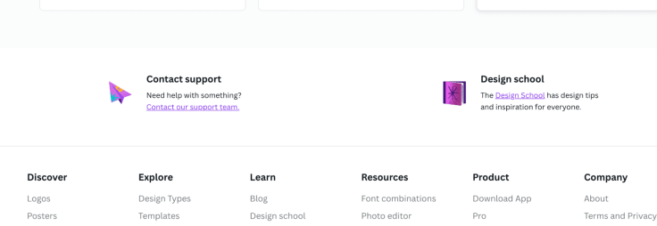
Below the categories, you can find a couple of tabs dedicated to different types of customers, so they can quickly find the knowledge resources they probably need.

Customers who want to learn more about the program can also go to Canva's design school.
Dropbox: dropdown menus, community support
There are heaps of content inside Dropbox's knowledge base. Still, it's easy for you to navigate.
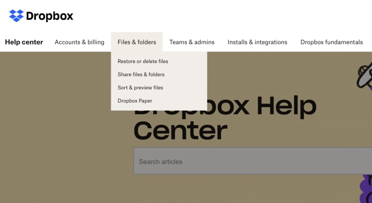
What makes Dropbox different is the dropdown menu. There’s a set of tabs that send visitors to different content areas.
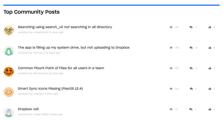
After scrolling down through the top reads and categories, you get to another interesting section – the Dropbox community. Dropbox has its own community of users who not only seek solutions, but also share ideas and best practices in Dropbox.
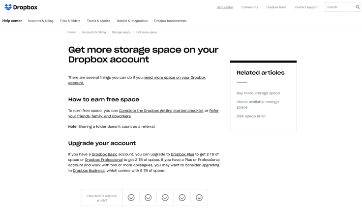
Personally, I also like the layout of Dropbox’s articles, because it’s clean and minimalistic.
Mailchimp: internal / external use
Mailchimp is an email marketing automation platform based in the US. Their tool allows customers to create email campaigns of all sorts.
Their knowledge base has two purposes.
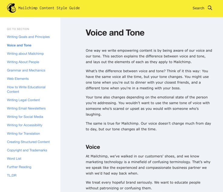
Apart from the external use of their knowledge base, it’s also an important resource for the internal company use. The knowledge base is packed with brand guidelines that help them build a brand that people love.
For example, there's their tone of voice guide which covers messaging from social media to email, technical writing, and translations.
Spotify: mobile-first
The main page of Spotify's help center is short and simple. But there's a reason for it.
It opens with a notable search box and includes several popular inquiries – all visible above the fold.
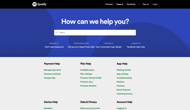
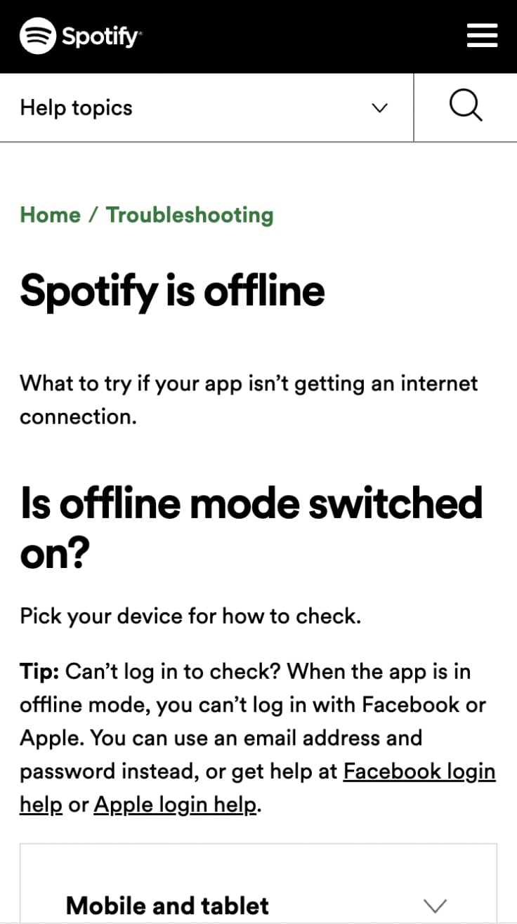
Given that many users use Spotify on their phones, this level of simplicity in design and information architecture is crucial. Spotify apparently adapted their help center to the needs of their customers.
Articles are brief and easy to scroll on mobile. The language is simple and to the point.
Airbnb: personalization
Airbnb’s knowledge base uses a bit of personalization.
After logging in, it customizes the displayed information based on the user's account. The user's name is added to the content and categories that may be of interest to the user. Personalization is always a nice touch as it makes the experience unique.
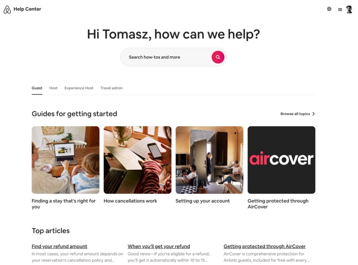
Again, this knowledge base divides content among different target customers. It’s divided into separate buckets between Guest, Host, Experience Host, or Travel admin. It helps you find what you need.
LiveChat: powerful search
One of the best knowledge base examples comes from LiveChat.
LiveChat is a powerful customer service platform that helps to connect with potential customers across different channels, build meaningful relationships, and assist customers at every step of their buyer’s journey. Using chat.
Since LiveChat has many features to play with, its knowledge base is packed full of helpful instructions and tips.
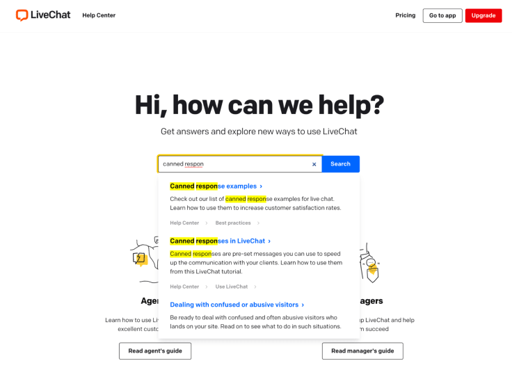
What makes this knowledge base stand out is the search bar. It's fast. It recommends knowledge base articles containing the searched keywords.
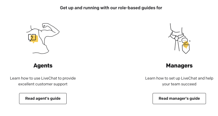
Another interesting section is mostly for new users. There are must-read guides for two primary users of LiveChat: agents and managers. Inside the guides, new users can find all the necessary information to master LiveChat. If new customers enter the help center for the first time, they instantly know where to start.
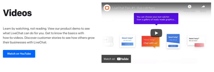
LiveChat also showcases video tutorials. The last section of the knowledge base displays video resources and takes a reader to LiveChat's YouTube channel which contains many guides and tutorials for a better understanding of the tool.
WhatsApp: powerful search, multilingual, multiplatform support
Even though WhatsApp's help center looks modest at first glance, it is humongous.
It's a good knowledge base example that shows how to keep things clear despite tons of content in different languages.
The first thing a user sees is a powerful search box which auto-suggests content based on the entered words.
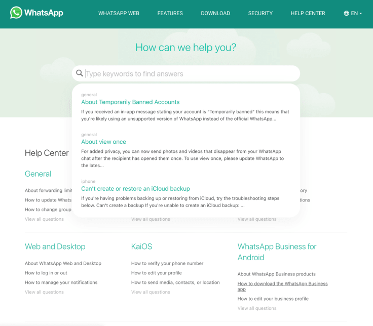
Whatsapp provides answers to people using different platforms: from Android, iOS, to KaiOS. You can look up the same topic across every platform!
And WhatsApp's knowledge base supports a total of 59 languages, which is incredible.
Square: minimalism, video
Square is a payment system that supports both brick-and-mortar and online stores. It has a wide range of products, from hardware to software. There's a lot to learn.
Their knowledge base includes information about all their products. Rather than clutter their site, they display only their most popular products. Customers can find more by browsing the drop-down menus.
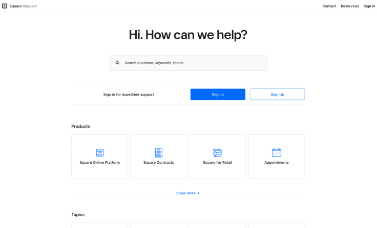
For those who prefer video, Square’s knowledge base has many pieces of content with video tutorials inside. Some of the topics may be complicated and the videos make them easier to understand.
Buffer: video, powerful sidebar
Buffer is a renowned social media management tool that allows scheduling posts on major social networks. It's a great tool. It connects businesses with billions of potential consumers on Facebook, Twitter, Instagram, LinkedIn, and other platforms.
When you open the knowledge base from Buffer, it greets you with a search bar in a contrasting bright blue color. It's difficult to miss.
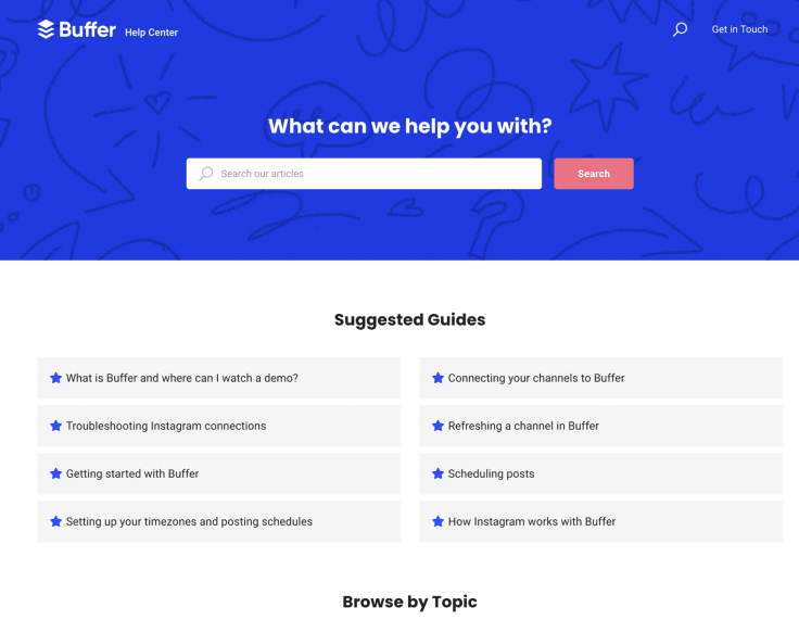
There’s even a section with instructional videos.

And there's a sidebar with tons of other content you can quickly access inside the articles.
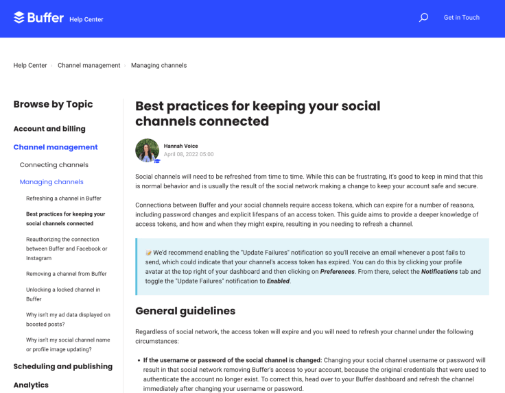
Asana: community, breadcrumbs, guides
Asana is a project management tool that allows organizations to plan, manage, and track the performance of projects.
Their knowledge base allows you to choose between three main content categories: “I want to learn…”, “I’m having trouble with…”, and “I’d like to upgrade…”. Once you select a category, Asana takes you to additional categories that eventually lead you to a solution.
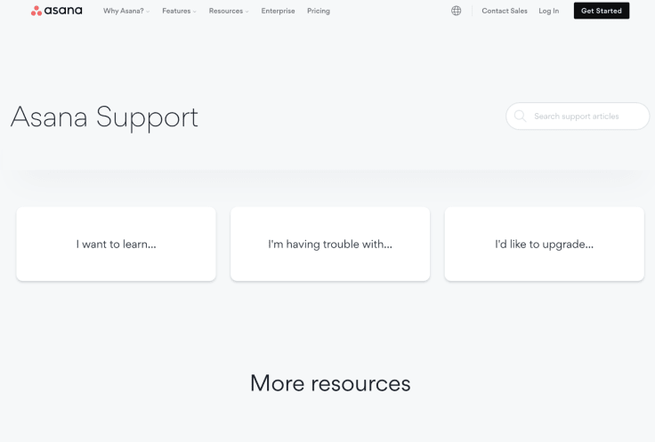
At the top of every article, you can find breadcrumbs that help in navigating through topics. Every article page has a sidebar that links to other categories and topics, so you don't have to do much digging to find other information.

Also, Asana has a separate help center called Asana Guide. It's a comprehensive resource for new users who want to quickly get on their feet with project management in Asana.
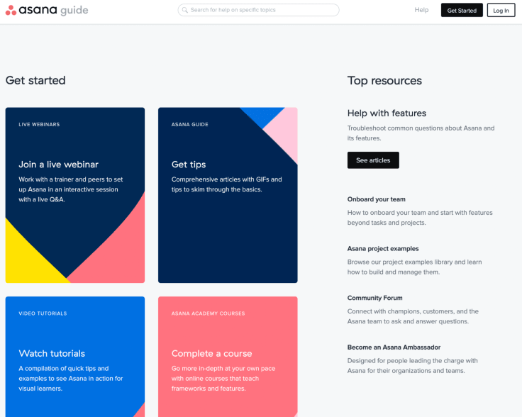
There are plenty of webinars, videos, and courses. They put a lot of effort into video training and have a knowledge-packed channel on YouTube.
There's also a community forum where experts hang out, provide answers, and share their insight.
UPS: contacting support made easy
UPS isn't really known for outstanding customer support, but they are a shining example of a good self service center.
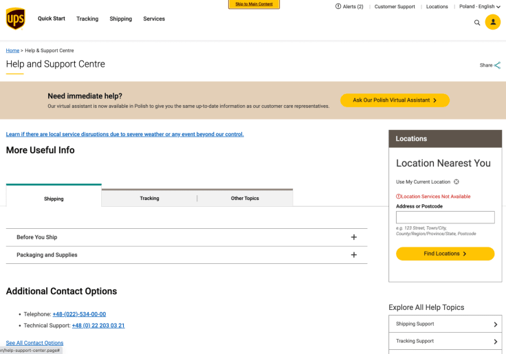
The main page greets visitors with an option to contact a virtual assistant, which is a chatbot.
Surprisingly, UPS invites customers to contact their support right after entering the knowledge base. Most businesses use the knowledge base as an alternative to live chat support. Offering it right away is quite unusual.
Over to you
If you want to start off with your own knowledge base and make your customer support even more effective, you can try KnowledgeBase for free for 14 days.
It's an AI knowledge base software that will let you build your knowledge base in minutes. Here's what it looks like inside:


